
Indeed Certifications
Redesigned responsive website and conducted user research to assess the usability of design explorations
Role
Lead Product Designer + Research
Duration
1 month for design + research
Company
Indeed
Why do a redesign?
Indeed Certifications had existed for nearly one year, and with that came a decent amount of design debt as we continuously added new pages, features, and components at a fast pace. However, we hadn’t gone back to revise older pages. This resulted in an inconsistent user experience.
Similarly, other Indeed products had made improvements over the past year, and we wanted to strive towards maintaining consistency across products used by job seekers.
Goals with redesign
Improve consistency and usability
across Certifications and other B2B Indeed productsImprove visual design
with mentorship from a Lead Visual DesignerPrioritize desktop designs + cognizant of responsiveness
Majority of our users were on desktop, but I still considered responsive design for flexibility across viewports
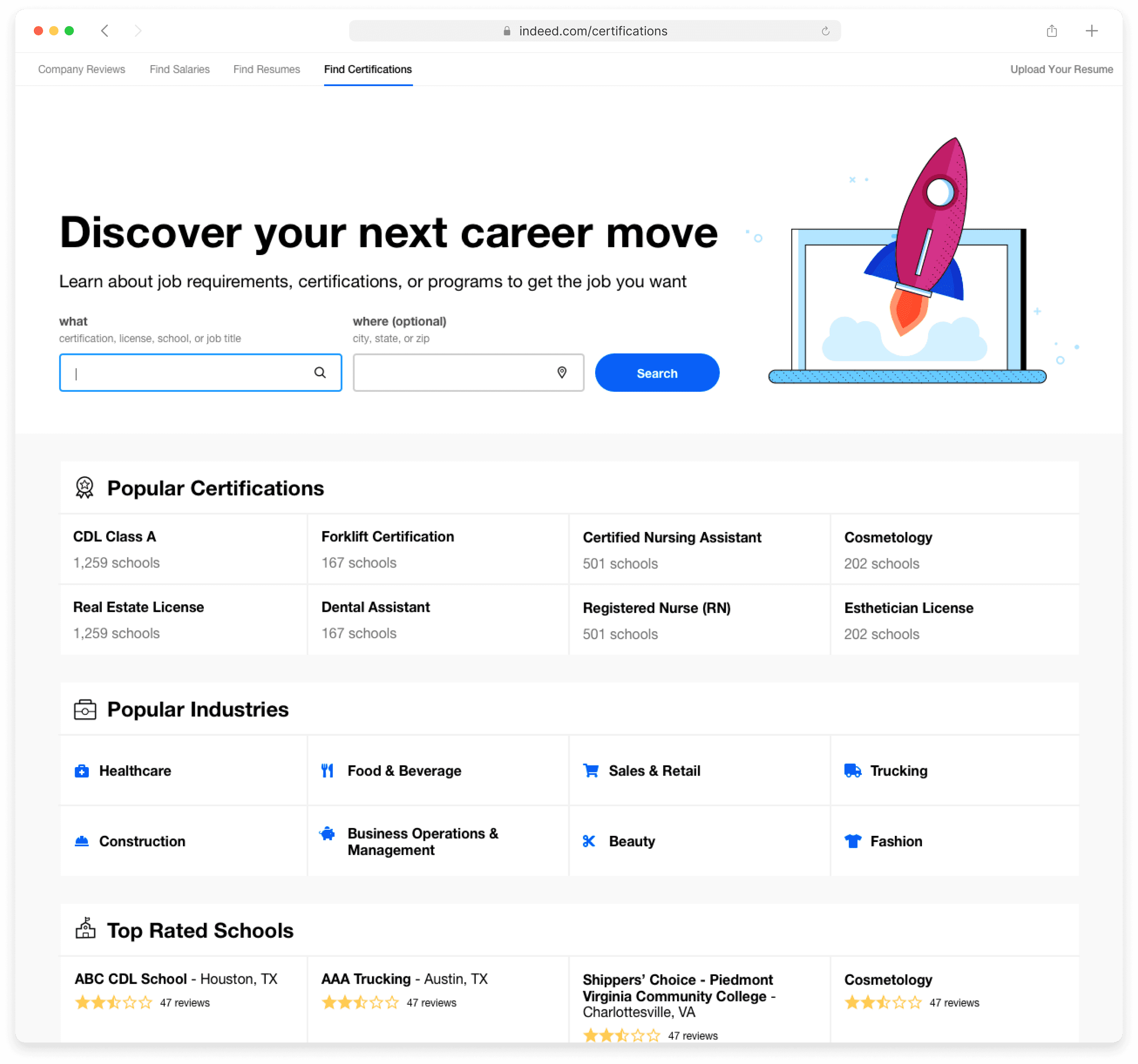
Search engine results page (SERP)
Previous SERP
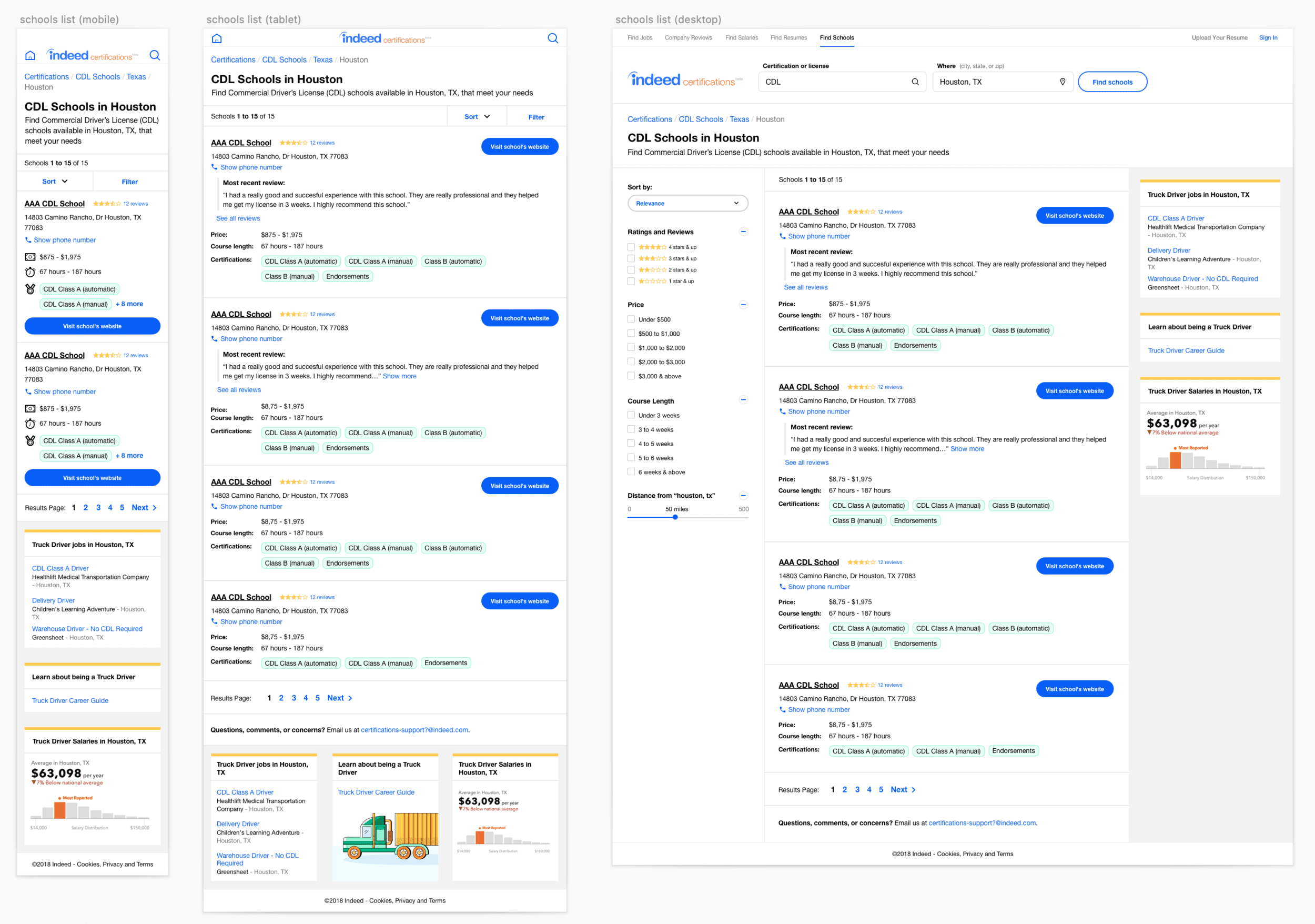
Redesigned SERP
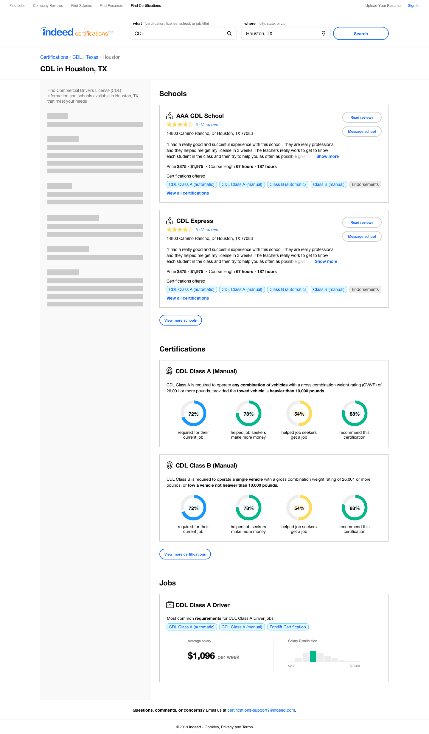
School details page
Previous school details

Redesigned school details

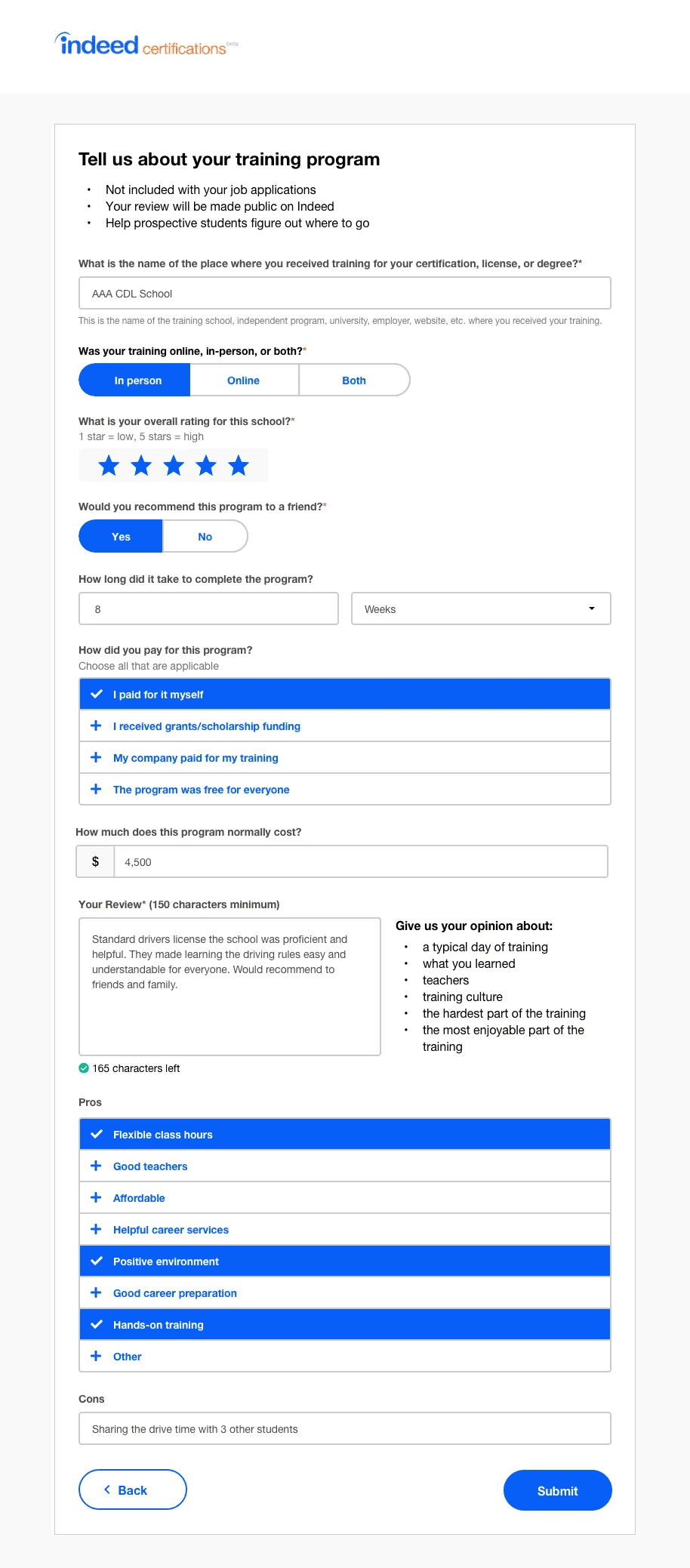
School review form
Previous school review form

Redesigned school details
Which designs do users prefer?
I created unmoderated A/B tests via UserTesting.com of the existing product vs. my redesigns in order to figure out the following:
Test usability of redesign explorations with some future vision work
Are there any improvements to make to the existing product and/or redesigns that wasn't considered or tested?
Do users prefer one experience over the other?
Prototypes
Searching for certificates and programs
Searching for certificates and programs
Research findings
100% of research participants preferred the redesigned experience over the existing site
Users liked new features and data, including:
displaying Certification pages within our SERP
information on relevant jobs and salaries
various data visualizations throughout the site
Users overall liked the redesigned UI, stating that it was more modern and clean
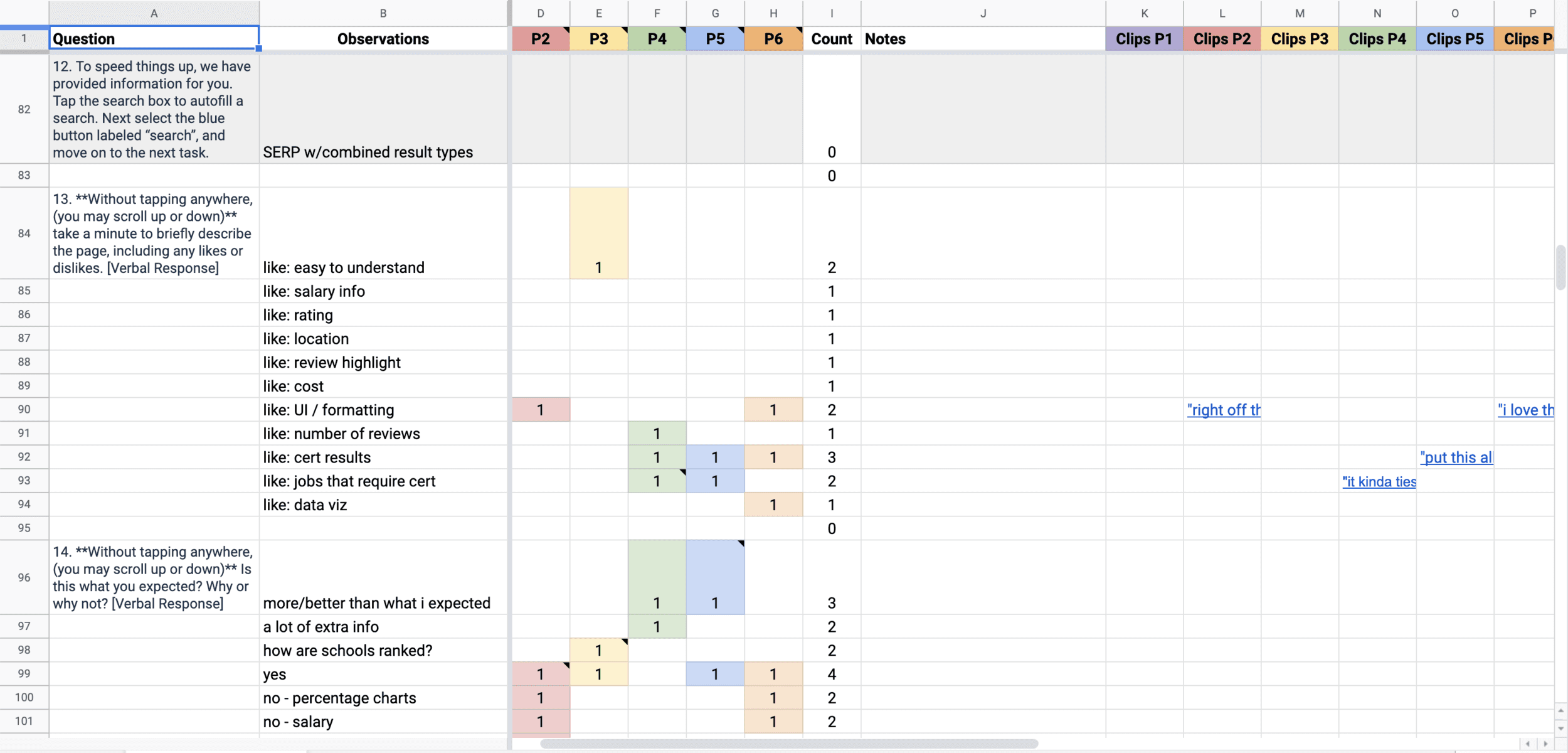
Below is a rainbow chart I created to capture research notes, patterns, and video clips.
Iterative development
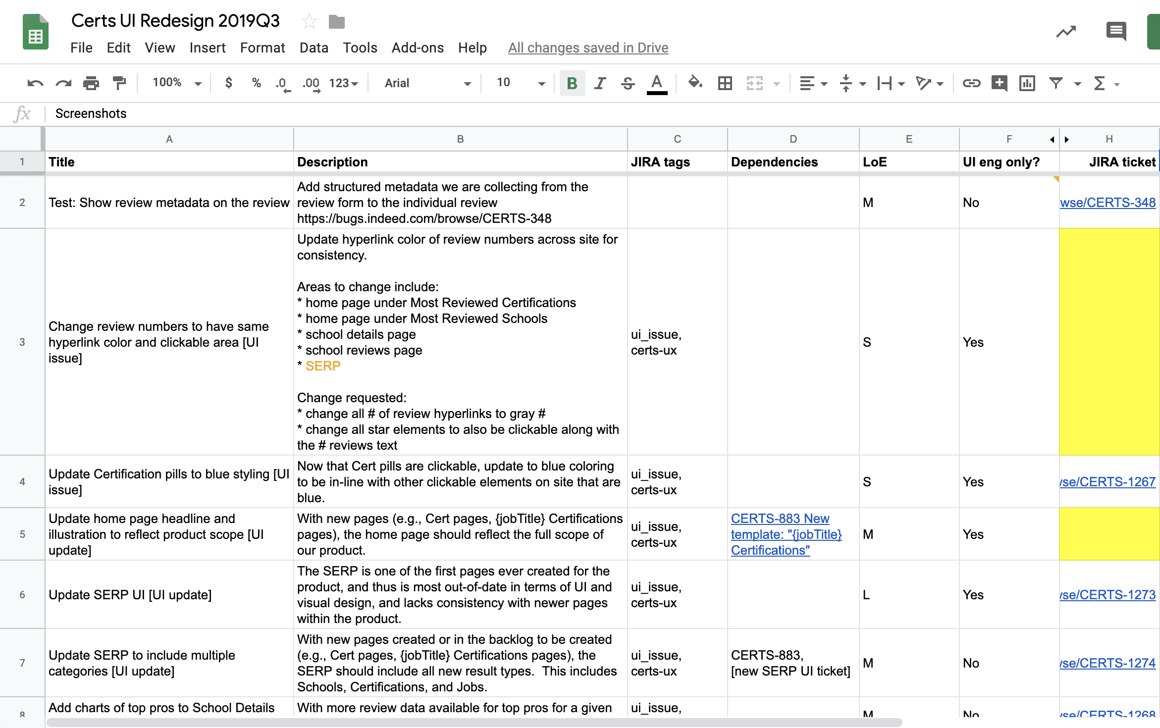
I shared these findings in a quarterly planning meeting with the product team, where I discussed potential areas that could be quickly implemented for near-term improvements across our product. We also discussed tests to iterate on towards implementing a new, consistent UI across the site. From these discussions, I created a spreadsheet of prioritized UX & UI work for the team to review from and provide feedback on.
Outcome
With the initial experiments we tested, such as adding structured metadata into user reviews, we saw the following results:
What coworkers say
“Jamie proactively reached out to me for tips about visual design which resulted in the series of constructive sessions. Her passion for visual design was obvious from the beginning. She is extremely open-minded and eager to improve her project based on the feedback from her team and peers. Every iteration Jamie did after our discussion was a significant improvement to the experience and I was pleasantly surprised how quick she can interpret and adapt principles from feedback into other areas of her designs.”
— Visual Designer
“Working with Jamie is fun - she always enables others to participate in UX efforts and it really creates a more inclusive team environment.”
– Growth Marketing Manager